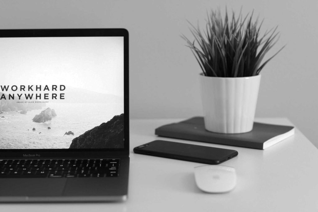
I’m sure you have heard the term “Responsive” been bandied around for some time now. Basically, a responsive website is a site that layout adjusts to best suit the device on which it is being viewed.
The use of mobile devices to view websites has exploded over the past few years and has now almost exceeded desktop. Because of this, it’s important your website looks good on mobile for your customers.
A responsive website makes browsing through mobile simpler and automatically adapts to the size of the screen of the device that it is viewed on. This takes care of the optimisation issues and there is no need for building and maintaining several websites for different devices – that is extremely inefficient and impractical.
Reasons why your website needs to be responsive:
1. EVERYONE IS ON MOBILE

Nowadays smartphones are not considered to be exceptions. We live in a society where excessive usage of smartphones is something that is considered normal. Today over one billion of people are accessing the web from their mobile devices and over 80% of internet users are smartphone users; simply put, if someone is online, it is likely that they are on their smartphones. This statistic is only the beginning of the story, I believe that these numbers will be bigger in the future. So, you need to think mobile, simply because everyone is on mobile.
This might not be a surprise for most of you, yet despite the impressive statistics below, many businesses do not yet have a mobile website. Hopefully, reading through these stats from Smart Insights will certainly convince you for the need for a responsive website.
- Over 20% of Google searches are performed on a mobile device.
- In 2012, more than half of local searches were performed on a mobile device.
- In the United States, 25% of internet users only access the internet on a mobile device.
- 61% of people have a better opinion of brands when they offer a good mobile experience.
- 25.85% of all emails are opened on mobile phones, and 10.16% are opened on tablets.
2. WHEN ON MOBILE, USERS BEHAVE DIFFERENTLY
In theory, the same people are behind both desktop and mobile traffic, but they behave differently across their devices. Even though they have a limited bandwidth, they consume a really high amount of all visual media, where their major focus is on images and short videos. Platforms like Instagram and Vine have achieved massive success just because they offered solely images and videos. For capturing this kind of traffic you are going to need an optimised design to harness the power of these types of media in order to engage your users.
3. ALMOST 50% OF WEB TRAFFIC IS MOBILE
There is no such thing as a business owner who is not interested in increasing traffic. Mobile media consumption is over 20% higher than desktop, meaning that almost 50% of all digital media consumption and web traffic is via mobile. So, if you are interested, as a business owner, in attracting mobile traffic, you need to think mobile and engage your visitors with visual types of media.
4. MOBILE USERS ARE MORE LIKELY TO BUY
Mobile users are actually spending more than desktop users, because smartphone users are the ones who account for the lowest Euro amount per every transaction. They make small and frequent purchases, so, if your business is selling something that is below €10, people who are mobile users are an ideal target audience for your business. The users of tablets have the highest average transaction compared to other devices and that includes desktop. Even these users won’t shop from your website if your mobile UX is poor.
5. THEY TEND TO SWITCH SCREENS

Almost 90% of people tend to switch between devices in order to accomplish their goals, meaning that even if you receive the bulk of your conversions via desktop, users will also engage with your website via mobile devices at one point of the sales process. In many cases when users are bored, they are searching for things that interest them, after that they move on to a desktop to finalise the purchase after they have previously found something they would like to buy.
So, if your website cannot handle screens of different sizes, you will be missing out on sales.
6. GOOGLE FAVOURS RESPONSIVE DESIGN
For some time now, Google has been favouring mobile friendliness in its rankings, but recently the stakes have been raised; having a responsive website is more important for Google than gathering organic traffic. In some of the latest Google’s algorithm updates there are significant penalties for those websites that are not meeting the standards for mobile optimisation. So, if you want to seriously improve the traffic of your website, or just keep the current one, your website needs to be optimised for mobile users.
7. HAVING A GREAT MOBILE WEBSITE WILL DIFFERENTIATE YOUR BRAND
If you have reached the point that your brand still needs website optimisation, you might feel that you need to catch up. This is true to some extent, but the reality is that many websites are still not optimised for mobile. A little over 50% of websites run by small businesses are responsive. You may wonder what this will mean for your business, well, you can have a fantastic opportunity to differentiate your brand from the competition.
According to statistics, almost half of your competitors have websites that are not optimised, and the ones who have already implemented responsive design are probably not doing it in the right way.
Conclusion
So, to put it into perspective, if your website does not load fast enough or give visitors what they are looking for, visitors will most likely abandon it and not return. Having a responsive design load times are better and faster, greatly reducing abandonment. The first step in optimising your website is implementing a responsive website design.
To achieve the best result consider hiring a web designer who specialises in this field. After that, you need to optimise your marketing efforts within your mobile responsive design, where you will take into consideration how customers are engaged and adjust your website accordingly. You want to make the experience for them as easy and as pleasant as possible.
Be sure to get your copy of our Free Website Content Planner to get started.
If you have a project in mind and would like to explore possibilities, get in touch by email or on 086-8710018.